Saltloaf Bakehouse
Turn passers-by into morning regulars and pre-orders.
01
Business
A small-batch sourdough bakery and café on a busy neighborhood corner. Bread comes out at 7am, pastries sell out by noon, and most customers live within a ten-minute walk.
02
Challenge
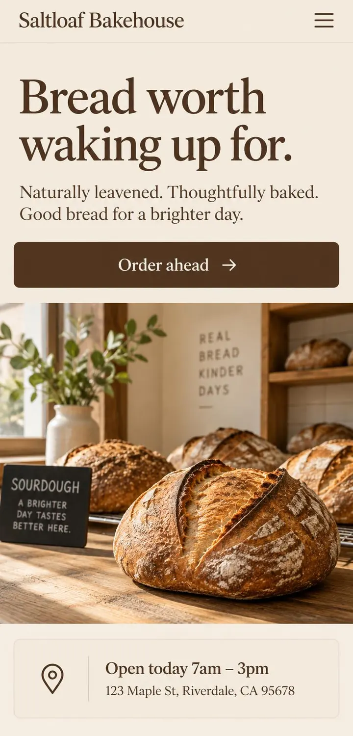
People find the bakery on their phones while deciding where to get breakfast. They need today's hours, what's on the counter and how to order ahead — and they need it in seconds, standing on the street.
03
Goals
- 01Show opening hours and location without a single tap.
- 02Make the bread look as good online as it does on the counter.
- 03Let regulars order ahead so they skip the queue.
04
What we designed
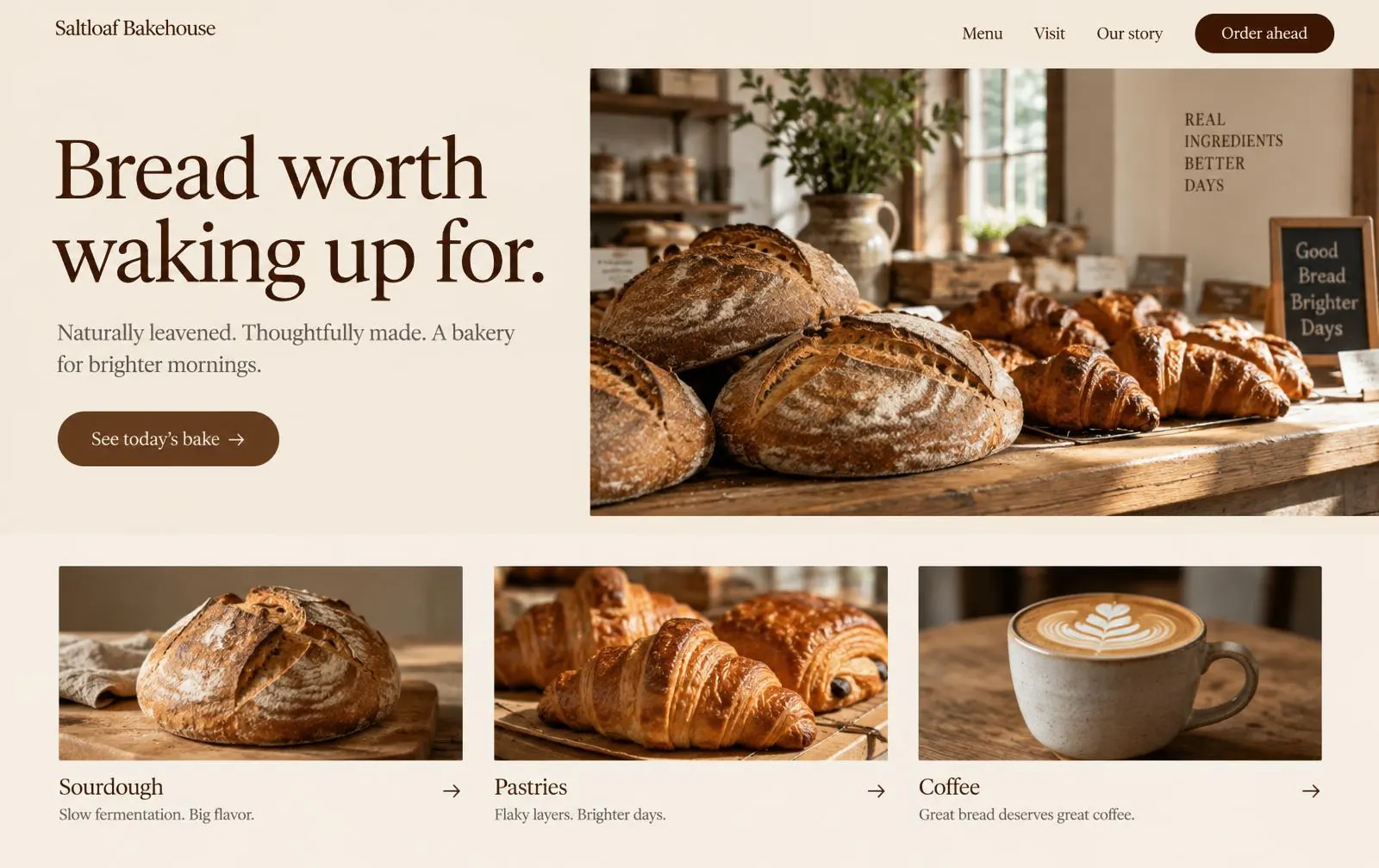
- A one-glance homepage: headline, today's hours and an "Order ahead" button above the fold on mobile.
- A simple menu page grouped by sourdough, pastries and coffee.
- A visit page with a map, hours and parking notes.
- An order-ahead flow that hands off to the bakery's existing order system.
05
Key screens
06
Design decisions
- Type
Soft, bookish serif + Warm humanist serif
A soft serif for headings gives the site the feel of a hand-written chalkboard without losing legibility. Body text stays in a clean serif at a generous size for easy reading on small screens.
- Color
- Flour #F4ECDF
- Crust #7A4A2B
- Espresso #3A2418
- Rye #C9A27E
Flour-cream backgrounds and crust-brown buttons come straight from the product. One dark espresso tone carries all text, so contrast stays high everywhere.
- Structure
- Photography leads. Each section answers one question — what's good today, when are you open, how do I order — in the order a hungry visitor asks them.
07
What this design is built to achieve
- Fewer "are you open?" phone calls, because hours are the first thing you see.
- More pre-orders from regulars who want to skip the morning line.
- A site the owner is proud to put on the window sticker and the coffee cups.
This is a concept, so there are no real-world results to report — only what the design is built to do.