Northpine Dental
Make a nervous first-time patient feel calm enough to book.
01
Business
A family dental clinic with a small team, a modern treatment room and a lot of patients who would rather be anywhere else.
02
Challenge
Choosing a dentist is a trust decision. Visitors compare clinics on their phone, look for reassurance and prices, and leave the moment something feels clinical, cluttered or unclear.
03
Goals
- 01Build trust in the first screen with calm design and plain language.
- 02Explain treatments without medical jargon.
- 03Make booking a visit the obvious next step on every page.
04
What we designed
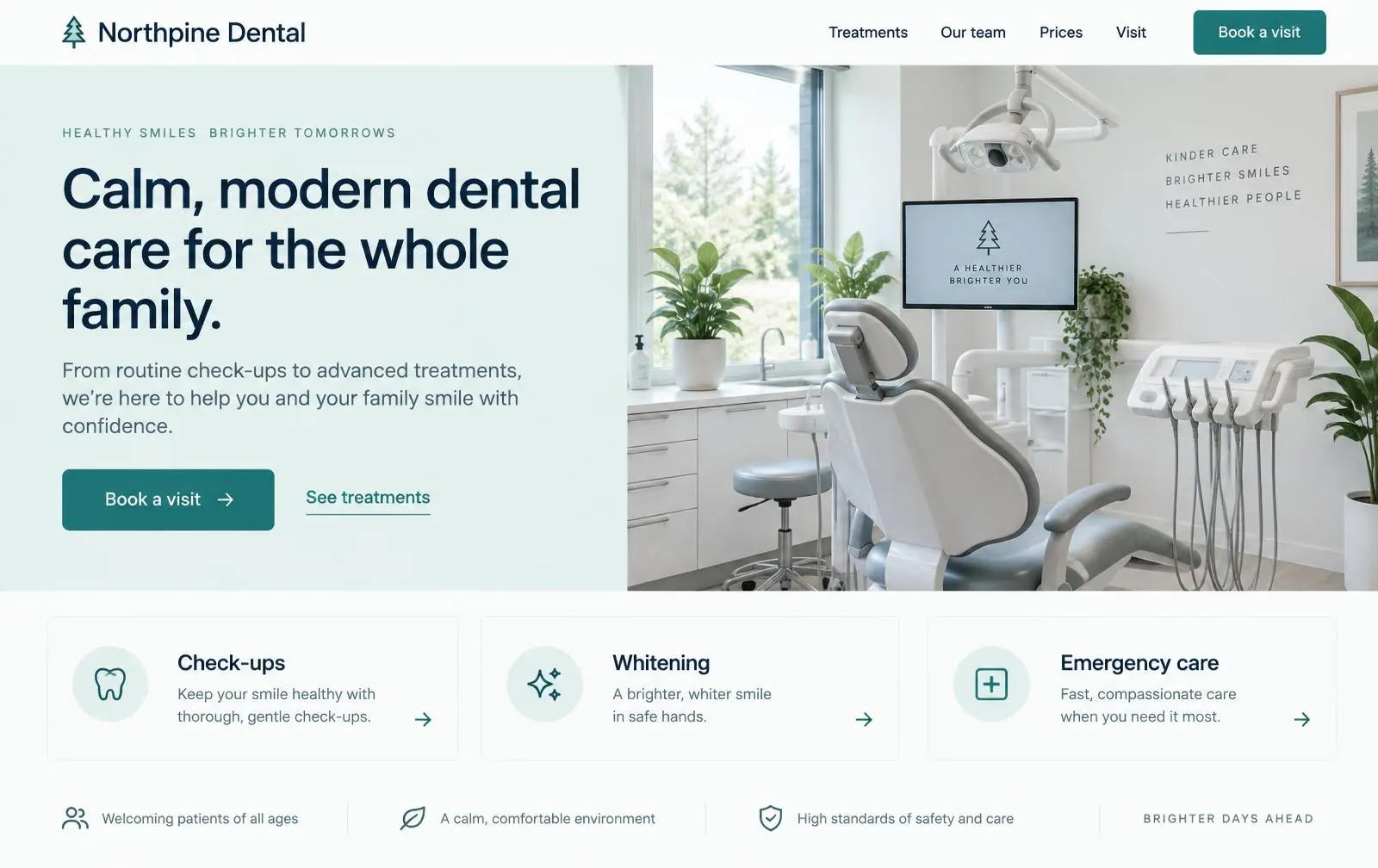
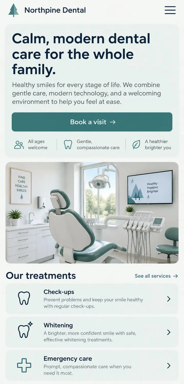
- A calm homepage with one clear action: "Book a visit".
- Treatment pages written in plain words, each answering "does it hurt?" and "how long does it take?".
- A team page that puts real faces to the names.
- A visit page covering insurance, parking and what to expect on day one.
05
Key screens
06
Design decisions
- Type
Rounded geometric sans + Neutral grotesk
A rounded geometric sans feels friendly and modern without being childish. Large headings and short paragraphs keep every page easy to scan.
- Color
- Pine #2E6E73
- Mint #E3F0EE
- Navy #10233A
- Cloud #F7FAFA
Soft mint panels and a deep pine accent replace the cold, bright blue most clinics use. Navy text keeps contrast well above accessibility minimums.
- Structure
- Every page ends with the same booking prompt, so a ready patient never has to look for it. Treatments are cards, not paragraphs, so they can be compared at a glance.
07
What this design is built to achieve
- More first-time bookings from visitors comparing clinics.
- Fewer front-desk calls about prices, parking and insurance.
- A first impression that matches the calm of the actual clinic.
This is a concept, so there are no real-world results to report — only what the design is built to do.